On The New Logo
by Mike

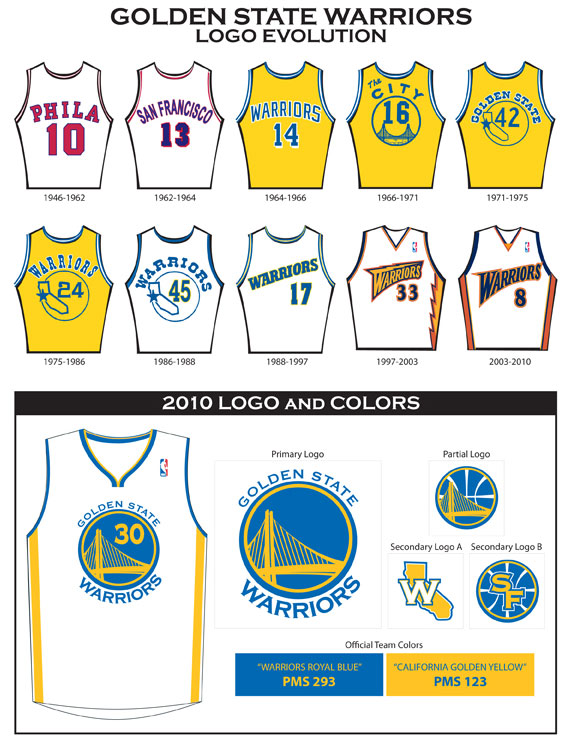
Warriors History
I’ve wanted to write about the new Warriors logo since forever, but a couple of recent posts have pushed me to finally put this item together.
The first was a year-end wrap-up post at Under Consideration — one of my favorite logo discussion sites – that ranked the Warriors’ logo as the second worst new identity of the year (here’s their initial review). And the second was a quick post at Golden State of Mind linking to this “alternative” logo featuring the Golden Gate Bridge and suggesting that it was an improvement. (my reaction: are you crazy?)
I’m somewhat mystified by the hating on the new logo, as I think the new identity strongly connects to the Warriors’ legacy while offering a unique look that is markedly better than all but the most classic of the current NBA logos. In fact, the only identities that I’d clearly put ahead of it are the Bulls, Celtics, and Lakers. (I’m also a big fan of the Nuggets’ mountain logo, but I don’t care as much for their actual uniforms.)
After the jump, read why I think the negative reviews are off base, along with a few alternatives to my least favorite aspect of the logo, the typography.
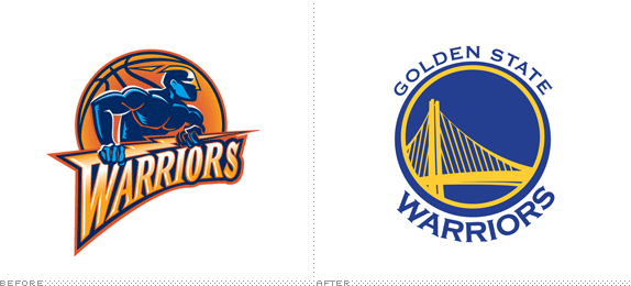
To start, here’s a big look at the new logo:

Now, I don’t think anyone who criticizes the new logo would actually defend the old logo — it clearly needed to go. But criticism of the new identity is hardly a fringe position so it bears addressing.
Most of the criticism focuses on the colors, the choice of bridge and its asymmetric framing, the typography, and the technical execution. My feelings are that the first two criticisms are off base, the third is right on, and the fourth has some merit but hardly overshadows the overall effort.
Colors
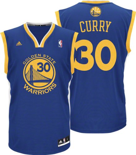
This one I just don’t get. To begin, these are very much the traditional Warriors’ colors until the “Thunder” logo, with a nice switch to emphasizing the blue over the yellow. I think the choice of blue in particular is well done, as it avoids the drabness of a navy without veering too far into the trendiness of an aqua or that powder blue that the Nuggets use. The yellow can be a bit much — particularly on the court, where I’d prefer to see the blue — but it’s mostly consigned to accent status. I’m glad they used white instead of yellow for the base color on the home uniforms (though it still doesn’t work as well for me as the road uniforms do).
Choosing two primary colors causes a certain amount of tension, but I’d certainly take it over the “classic” primary-secondary match that we saw with the blue and orange in the old logo.
The boldness of the way the colors are presented — no gradients, no highlight colors, just flat blue and yellow — goes a long way toward providing the retro feel that they were clearly aiming for with this identity. Which is a good segue to the second point of criticism…
The Bridge Logo
A circular logo. A bridge that hasn’t been built yet. The asymmetrical framing. Obvious ties to the old city jerseys. I love all of it — but apparently not everyone agrees with me.
Sure, a circular logo is different than most of the other NBA logos that are out there, but that’s part of the reason why I like it. Do we really want something with a wild animal on it? Or a basketball with a tracer? Or worse: something that looks like the “thunder” logo?
Add to that the obvious Warriors legacy connections, as a circular logo was very much the norm for the team from ’66 until ’88. And, of course, the logo that provided the greatest inspiration for the current identity, the classic “City” jerseys, featured a bridge — albeit a different one — in a circle. I’m more than happy to connect to that sort of history.
As for the specifics of this bridge, I couldn’t think of anything more appropriate than the new Bay Bridge. It’s the most appropriate bridge in the area (unless you want the San Mateo); if you’re going to slight Oakland by naming them the “Golden State” Warriors in a forced effort for multi-geographical inclusiveness, it would be adding insult to injury to then use the San Francisco-centric Golden Gate Bridge in the primary logo.
And, really, do we want to use the current Bay Bridge? (The SF side would just look like the GGB.) Choosing the new span certainly looks cool and distinct, it’s going to be done in just two more years (hopefully), and it gives an extra tip of the cap to Oakland since it’s the span on their side of Treasure Island. I really like the asymmetric nature of the bridge within the circle, as it adds a dynamism that is missing in, say, the old “City” jerseys. At first, I thought the number placement in the circle on the jerseys was a little too cute, but it also solves an obvious design problem in a fairly elegant way and once again ties into the team’s logo legacy.
The Typography
Now, here’s where I’m definitely with the haters. Copperplate Gothic? You can call me a font snob (and you wouldn’t be wrong), but I have a hard time respecting a professional logo that uses a standard system font. To me, Copperplate Gothic just screams out homemade business cards and “restaurant awning!”
Sure, it could have been worse. They could have used Comic Sans, of course, or other system fonts like Papyrus, Hobo Tramp, or Arial (or something like Bleeding Cowboy — which is sadly in the direction of the old western typefaces they used to use). I guess if they were going to go with something clichéd, Bank Gothic would have been an improvement over what they chose.
Joke versions — click the thumbnails below for larger images
Comic Sans
Papyrus
Bleeding Cowboy
Hobo Tramp
Arial
Bank Gothic
But I would have been happier to see them try something a bit more sophisticated, like Verlag, Gotham, Whitney, or my personal favorite of the ones I tried out, Neutraface Slab (apologies that I didn’t kern any of these, so the letter spacing is pretty rough).
Serious attempts at improvement
Gotham
Whitney
Verlag
Neutraface Slab
Bottom line is that the typography is definitely a facet of the new logo that I would be happy to see changed in a future update. I agree with the haters on this point.
Technical Execution
Here’s another aspect where I think the criticism has some merit. Not only do I find the typeface to be clichéd, but the kerning and layout of the type has issues. For example, check out how much higher the final stroke of the “W” ends compared to the top of the “A” in “Warriors.” Granted, getting type to line up on a circle is tough — just look closely at the type on any of my fake logos above — but this is a case where I think the professionals could have put in more effort. Or chosen a typeface that is a bit easier to line up on an arc (the blockiness of Copperplate Gothic didn’t do the designer any favors on that front). Outline the paths and spent a bit more time redrawing things in Illustrator to get it right.
Another point of concern is the outermost blue circle, which is thinner on the top than the bottom. This was likely intended to balance with the varying sizes of the type (“Golden State” is much smaller than “Warriors”) and add depth, but it comes off looking like a mistake. But still, this one is hardly a critical offense.
A final point of technical criticism is the design of the bridge icon, which can be separated into two separate concerns. First off, at larger sizes the drawing of the cables looks a little odd — not exactly sloppy, but it’s a bit harsh and the varying widths leave a bit to be desired.
Can you see the cables?
Second, and more persuasive in my opinion, is that it’s a very hard logo to reproduce at small sizes, or in more difficult formats like hats, where the thin cables can lead to ugly stitching or just get completely lost.
But at the same time, I wouldn’t want to see them thicken or reduce the number of cables — if they did, it might start looking like that other bridge. So this is another one I can live with: The reproduction problems remain, but I’ll take it for how well it works in its primary formats (jerseys, TV titles, and the center court logo).
Secondary Logos

Secondary Logos
I find the secondary logos to be just OK — the basketball stripes seem a little clichéd, but do a decent job of adding visual interest since these are used at smaller sizes where the bridge cables won’t show up well. I’ve only seen the partial logo on the backs of jerseys right below the neck (and occasionally in graphics on CSN), and they look just fine in that context.
I didn’t realize this until I read the Warriors’ press release, but apparently the “W” on the state of California is meant to mimic the star that was on the circle and state outline that made up the logo on the 70′s and 80′s jerseys. Go figure.
The “SF” is the one I don’t really get, as it seems a forced effort to throw San Francisco residents a bone. Still, I’m not really sure where the secondary logos are being used (I’ve seen the “W” logo on NBA.com box scores, but that’s about it), so maybe they’ll make more sense in action.
Bottom Line
Despite some flaws — the choice of typeface and some technical issues — I still love this logo and overall identity. There’s no question that it’s a massive improvement over the old logo (reminds me of that line from Arrested Development: “That’s like comparing prime rib to…weird brother of prime rib”), and I would argue that it is firmly in the upper echelon of NBA identities.
And at the end of the day, there’s a certain point where it just comes down to whether or not you like the aesthetics. 1700 words into this post, I hope it’s fairly clear where I stand on that front (I think it looks great!).
One point that I haven’t addressed is that the logo doesn’t really scream out “Warriors” — but that doesn’t bother me, as the “thunder” logo is the only one in the team’s history that has done that and it was hardly one to remember.
Eventually, I hope that they’ll clean it up a bit — similar to what the Hornets and Timberwolves have done recently — though aside from the typeface I don’t think it needs too much work.
The new logo is clean, retro, unique, good looking, and — dare I say it — classic. That makes it a clear winner to me.
Tags: logo